
3 common mistakes to avoid with your school logo.
Do you work with your school or college branding?
As designers and educators of all things school brand we’ve worked with our fair share of school logos and we know that being consistent with your brand doesn’t happen by accident! But there are a few simple things that you can do to make life easier for yourself.
In this article, we take a look at some common mistakes to avoid to ensure that your school or college is always creating the very best marketing, materials and designs possible.
Don’t make your logo too big
Example prospectus cover with proportional logo
Your school logo should be a unique representation of your school or college. It is the branding equivalent of your name, or signature and is an important part of letting your audience know that it is you talking to them.
Example prospectus cover with logo too large
And while your logo is important, from a messaging standpoint it usually isn’t adding anything else and as such you should place it accordingly on your marketing (internal and external). Use an appropriate location and scale to make it clear who the message is from and avoid the temptation to create a design that is essentially shouting your name but whispering your message. Remember that unless you are doing a dedicated brand awareness piece, what you have to say is more important to your audience than your name.
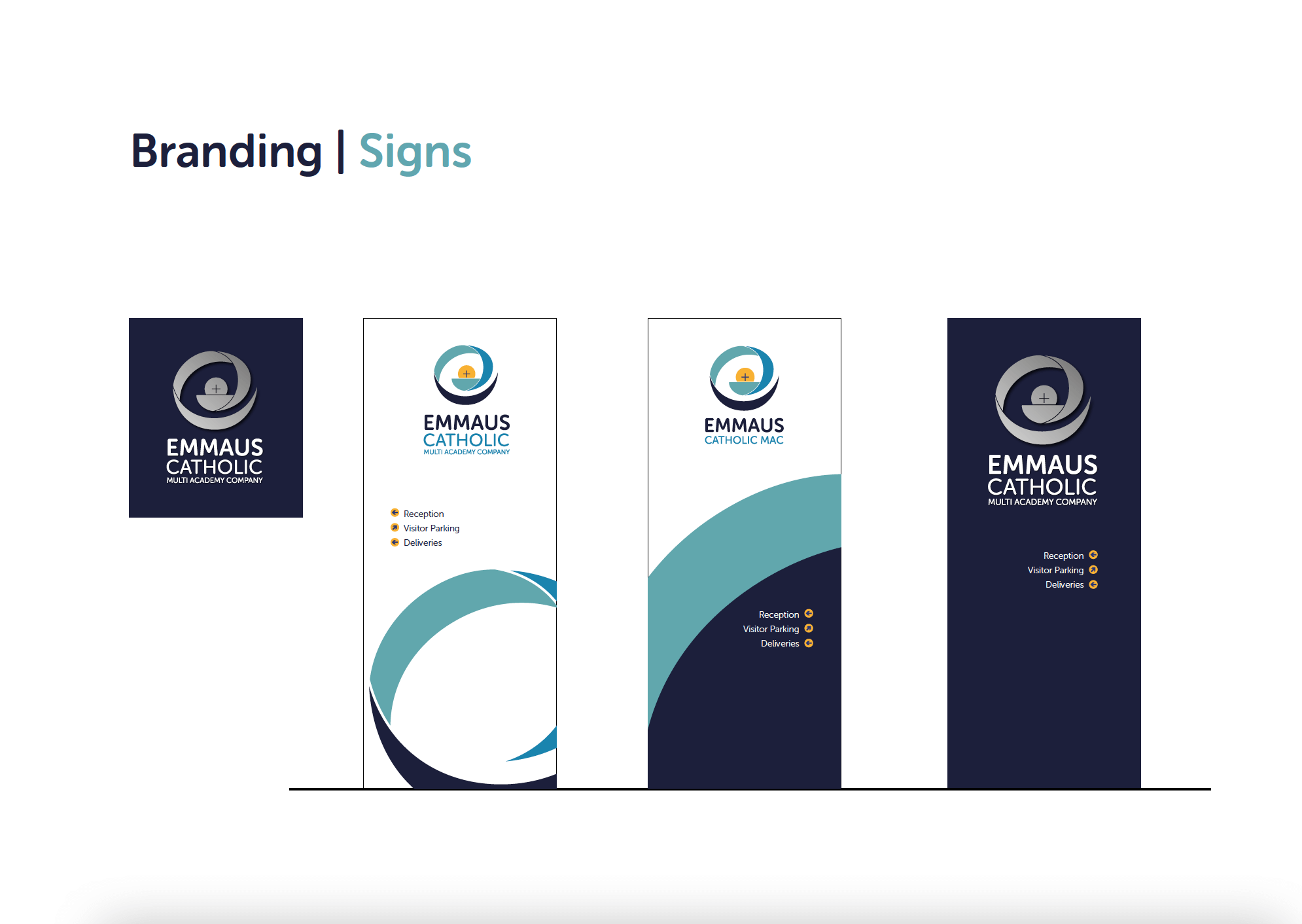
If you have brand guidelines (a document that is often created when you create, develop or update a corporate identity and show its intended use) then remind anyone using your brand to refer to these until they are comfortable working with your identity. Examples of a brand guide can be seen below:
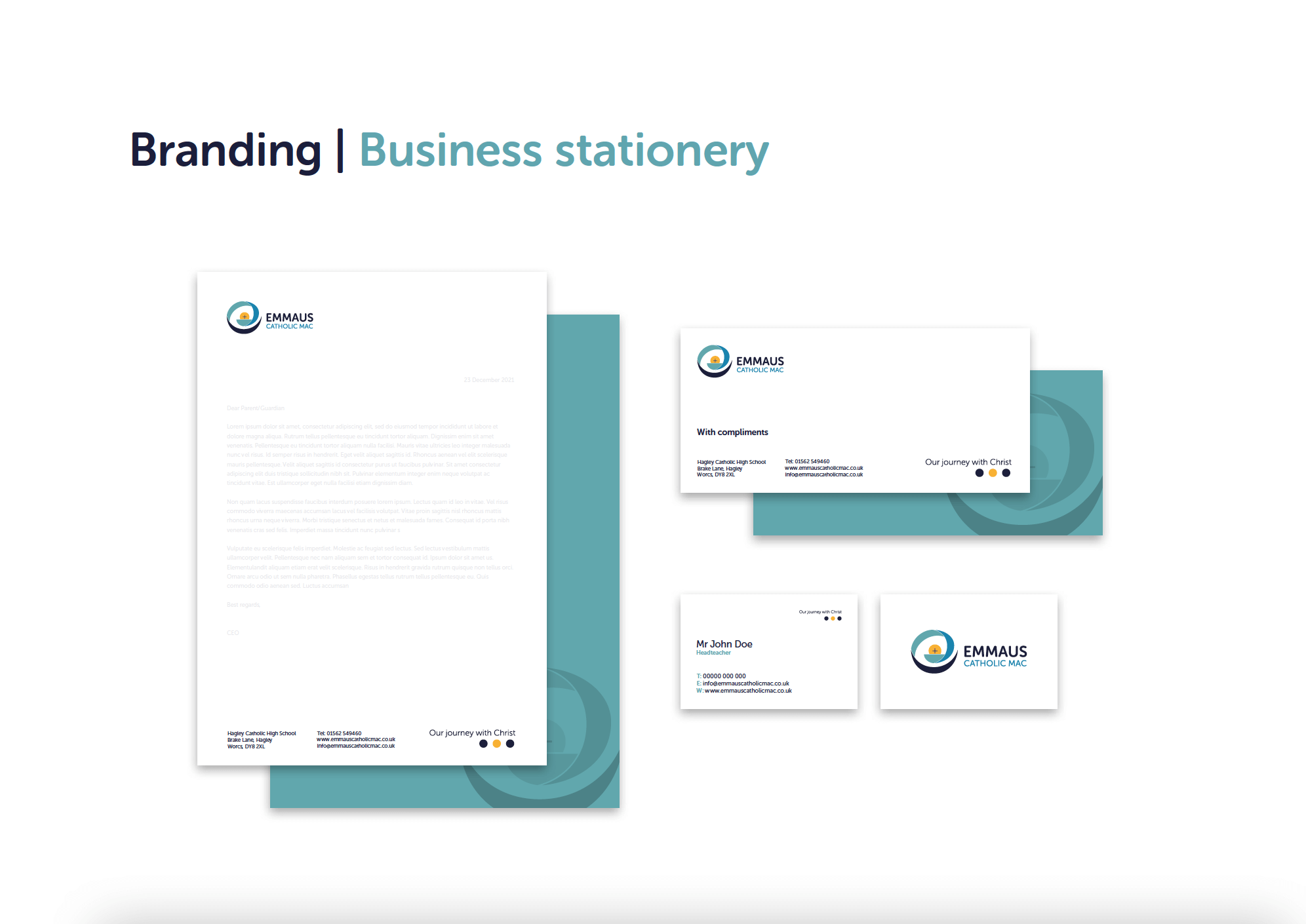
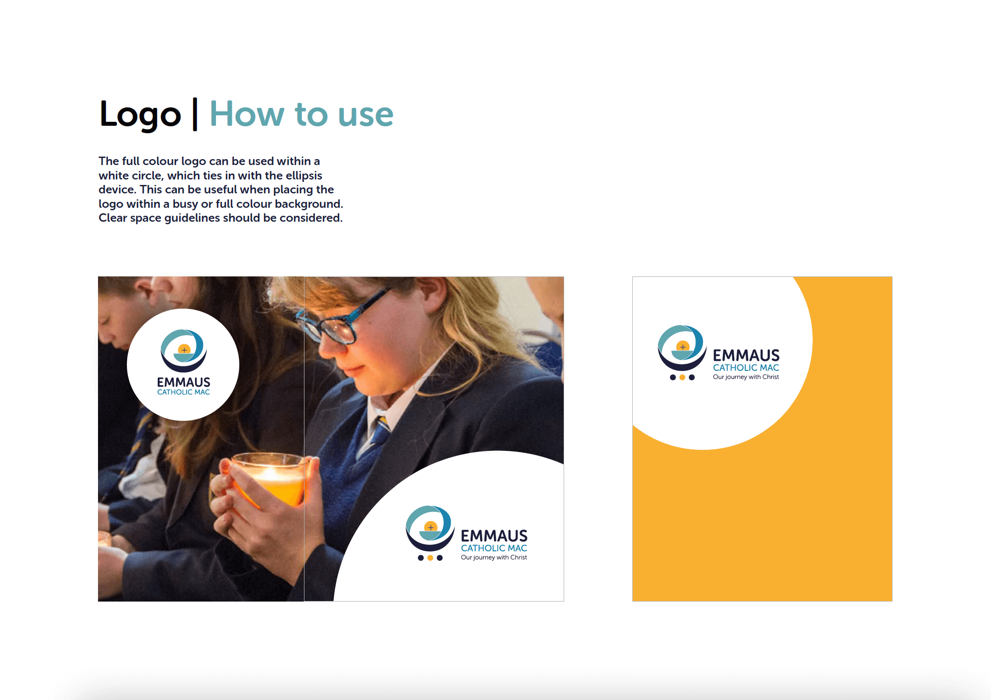
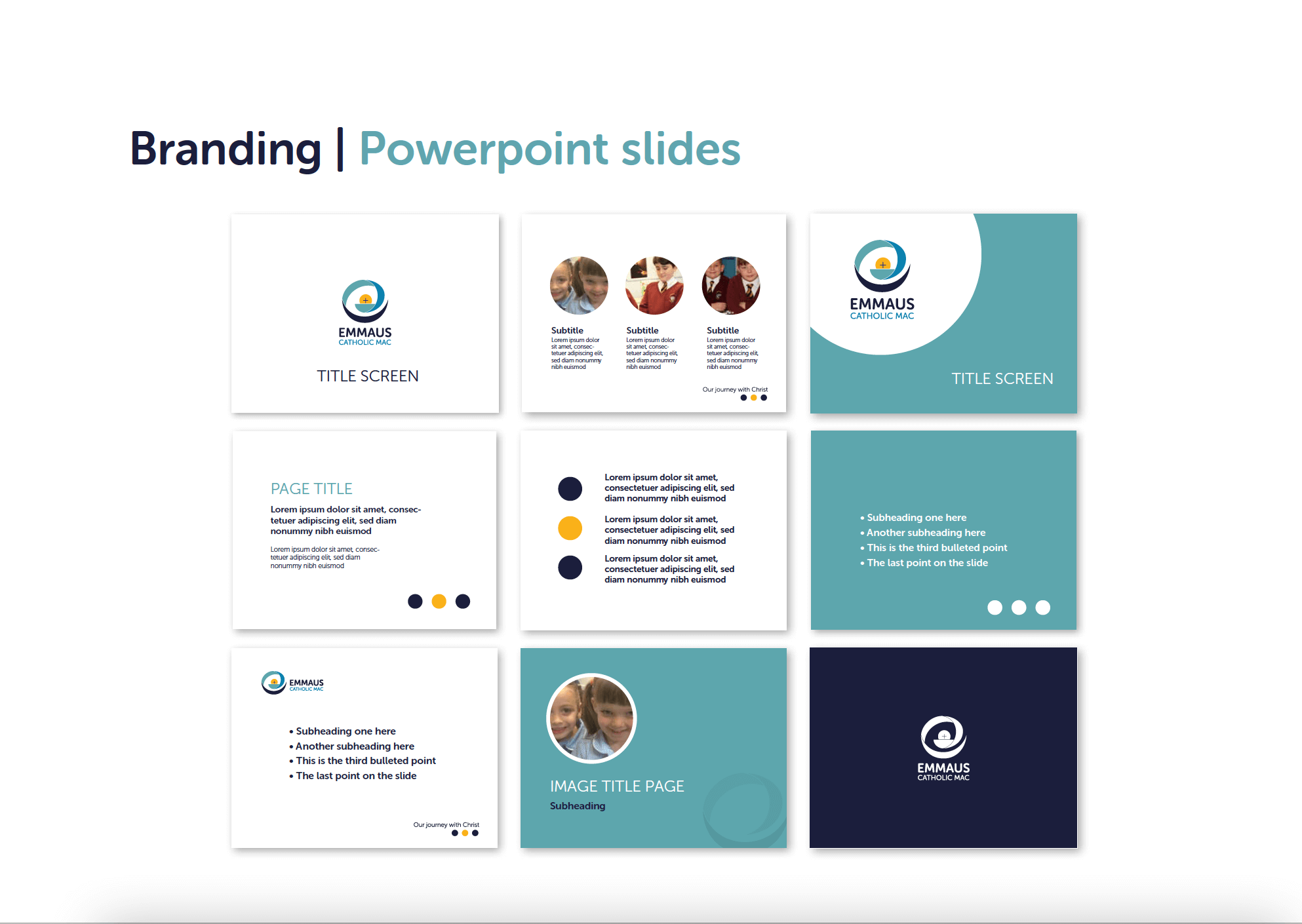
Don’t use the same logo everywhere
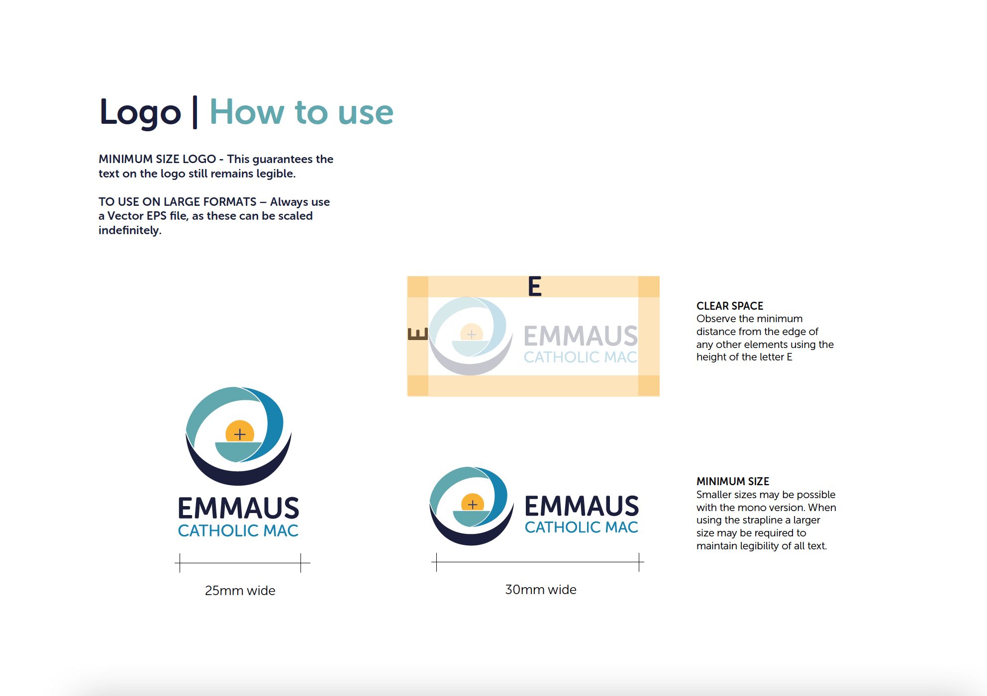
A well-designed identity should be flexible enough to allow you to create any document or design required. To do this it will provide you with multiple versions of your logo. It is easy to forget that they exist and just use the same logo across everything. The problem is that the logo you are using may not be suitable for the intended application, increasing the chance that it could result in pixelation, poor spacing or low clarity. All of which you want to avoid so that your ‘name’ is never associated with poor quality.
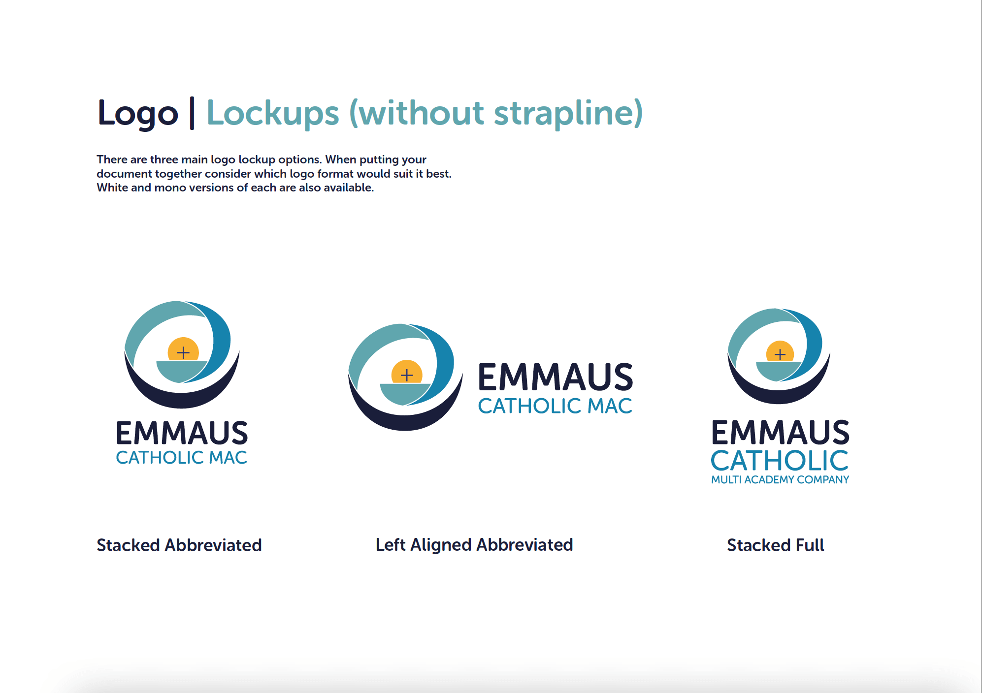
It’s worth taking the time to understand the different types of logo files you may have been given and why you would pick one over another. You will usually have the following
Multiple lockup versions. A lockup is a fancy name for a logo that presents your mark (logo, crest or icon) with your name. It is what most people think of when they us the word logo. Different lockups are created to suit different design layouts or uses.
Full colour and one colour logo files. Your main logo (or lockup) will be a full colour version, but this is usually complimented with a black version and a white version that will give you more options to place it on documents, marketing and documents with maximum visibility.
Bitmap and vector files. Bitmap files (jpeg, png, tiff, gif etc) are useful for most documents and will be your most common day-to-day logo files. Bitmaps don’t scale up very well though so for anything larger you will want to switch to vector files (pdf, eps, ai, etc), which deliver perfect quality at any scale. You may not be able to work with file types such as EPS files in-house but you should always have them available for suppliers who request them so that you are always providing the very best version of your logo.
Don’t assume that if your logo is on a document then it’s ‘branded’
Your logo plays a large part in your brand arsenal but remember that it’s power is limited; it presents your name and little else. To project a strong, consistent corporate image you should never neglect the other elements that make up your brand identity, including colours, typeface (fonts) and image. Consider how much less seriously you would take your favourite brands if every time you saw their product or marketing they had used a completely different set of colours, fonts or images. The lack of consistency would not be overcome just because they popped their logo in the corner.
Take some time to read through your brand guidelines and see how everything has been designed to work together to create your larger identity. If you don’t have guidelines then don’t panic as any decent design or brand agency should be able to help you create something that helps you. Prices for this will vary a lot depending on the agency as they take a lot of time to put together but you should expect to pay upwards of £600 for a basic guide and from £1500 for something more detailed. Each agency should be able to give you an idea of what they will include.
Asking for some brand guidelines doesn’t mean that you are rebranding. You don’t have to change your logo unless this is part of your requirements, although if your existing logo is in poor shape or you only have a very old, low quality version of it then it might be a good idea to at least get it redrawn or updated as part of the process.
Ask a question
If you’re still wondering how best to achieve excellence with your school brand then please get in touch via our contact avenues.