A new brand that remembers the past.
The brief from the head at Chipping Norton School was to create a brand that would better reflect their high aspirations and reconnect with the heritage and history without looking out of date.
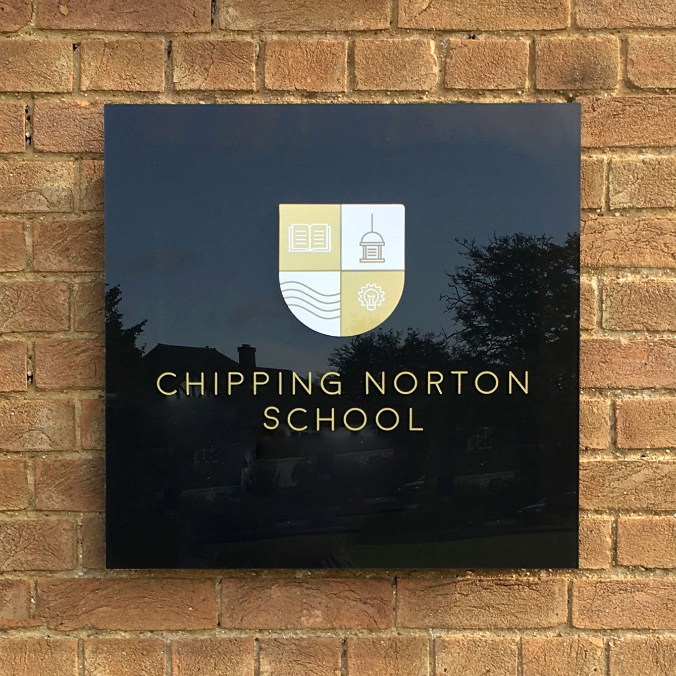
We created a strong visual identity by re-introducing the school’s original colour pallete of black and gold (over the years the branding had drifted to green) and designing a new crest that depicts their location, history and educational philosophy.
A unified set of house logos were created at the same time that use heritage colours to augment and soften the black and gold primary palette. As part of the brand update we designed and installed a suite of new signs, both inside and outside of their building, creating a consistent message and style for visitors to the school.


