
A complex challenge. A simple solution.
When IBSCA approached us to help them rebrand we were excited for the possibilities, despite the challenging brief, which needed us to create a new logo, help them define and position their message and sub-brands, and create an identity that they could manage easily without agency support.
Oh, and it also needed to translate well in multiple countries and play nicely with the global IB brand without copying it in any way.
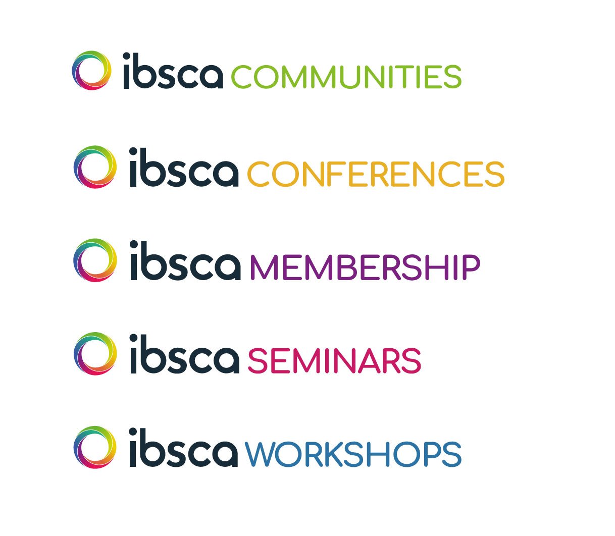
The answer was to create a bold, clean new logotype and colourful spiral logo. A fresh colour pallete and clean typeface make the new identity clear, with each sub-brand using one of the colours in the main logo.


The final solution offers lots of ideas for how IBSCA can use the new brand across their marketing channels to create vibrant, clear designs that capture their personality and convey their message.