
Colour Comes to Ark St Albans With New Brand Graphics
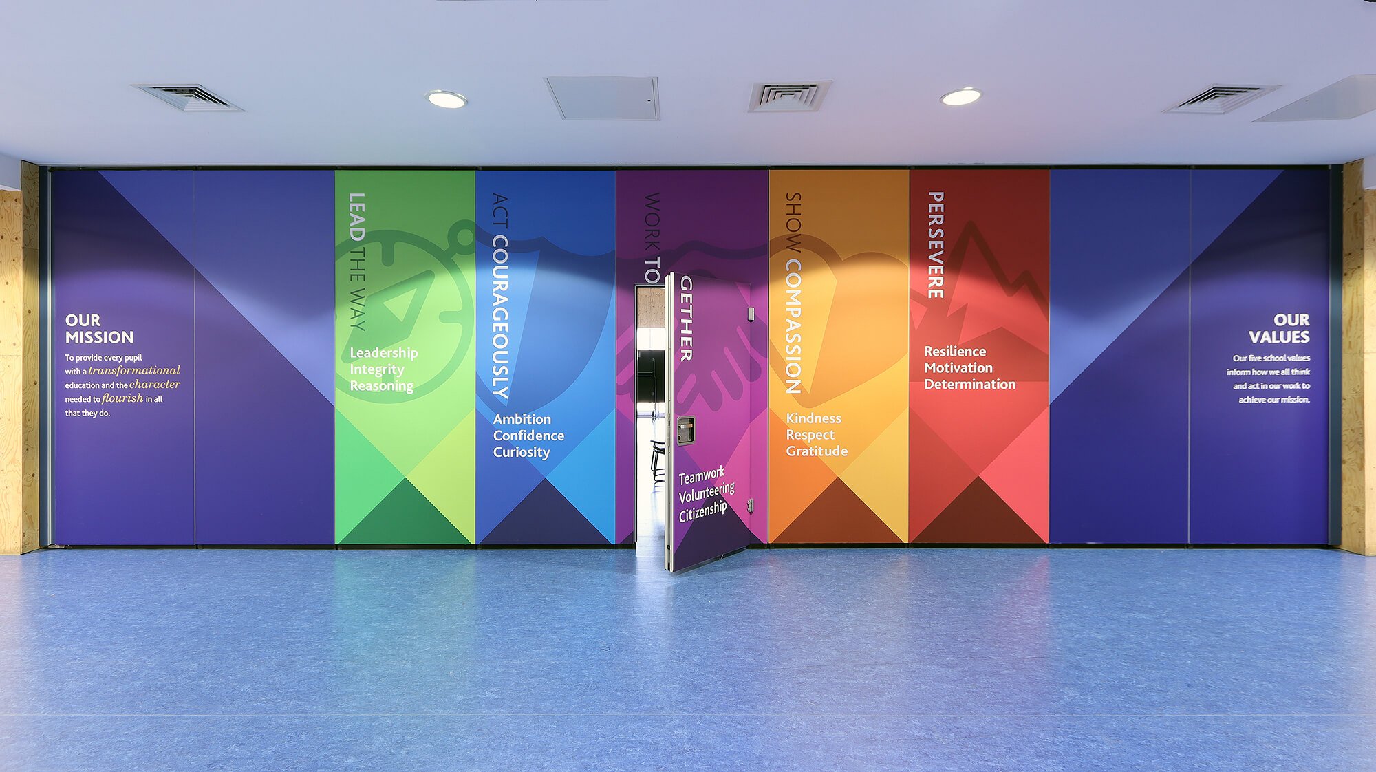
Over the summer, the dull, beige plywood walls in Ark St Albans’ expansive atrium have been transformed into a riot of colour and aspirational messaging as part of a whole-school project to refresh and embed the school vision and values for the next five years.
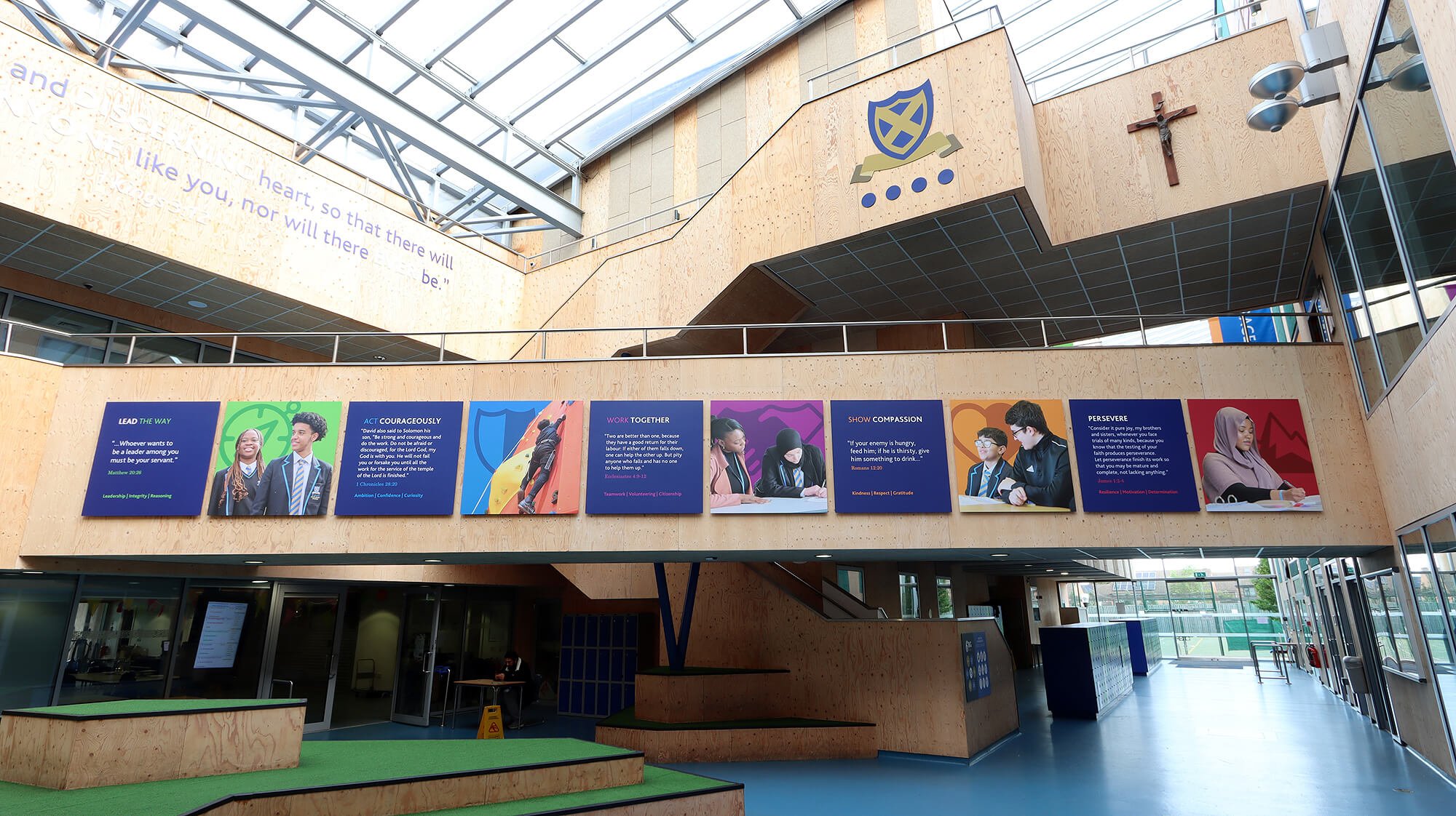
It’s impossible not to know what the school stand for now. Five bright new colours were carefully selected to compliment the existing school branding, and designs were created to suit each different zone. It was important to get the scale of each display right so that they are appealing, legible and not too overpowering.


Student images were used throughout the project. Specifying wallboards for many areas allows for any images to be updated quickly and with minimal cost implications in the future should the school need to. A useful consideration when using student photography.

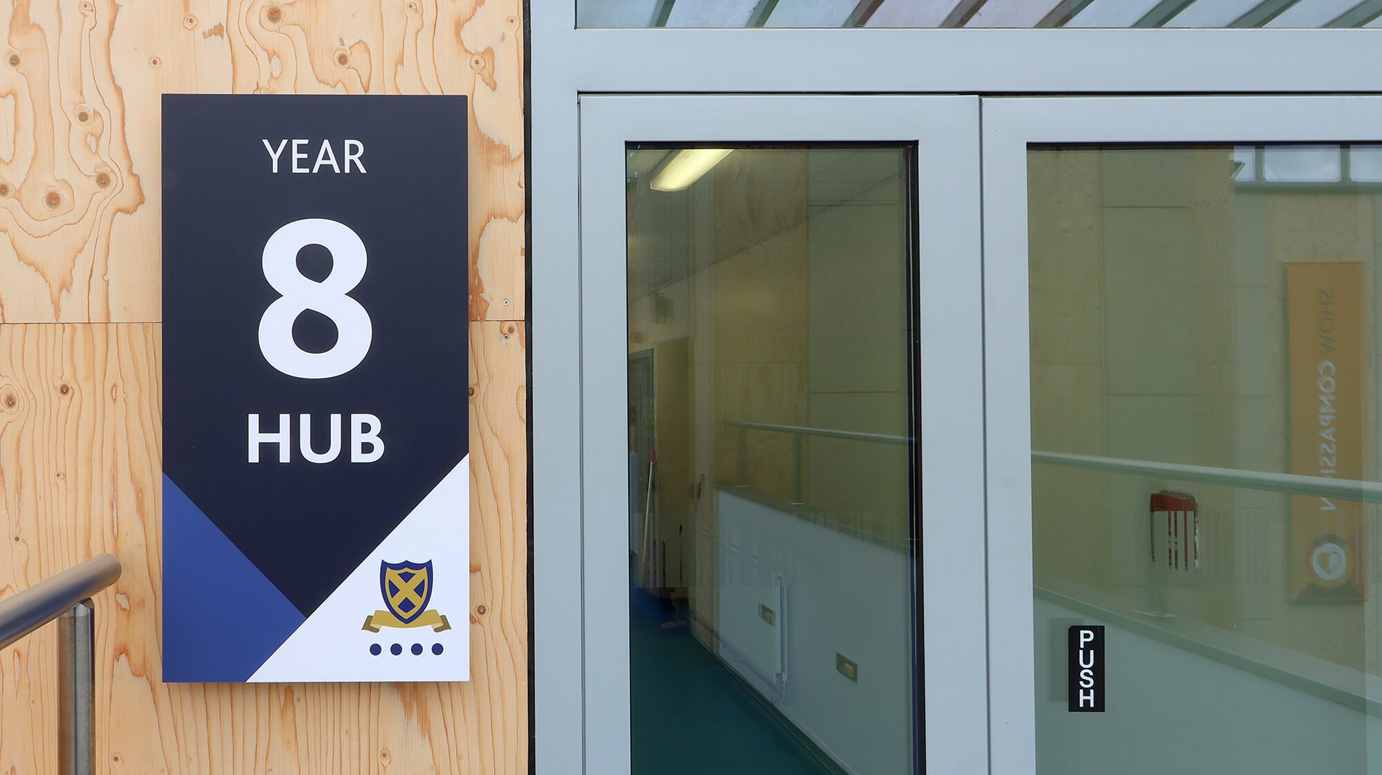
Away from the atrium we installed duplicate graphic sets in each of the yeargroup hubs, ensuring that they each were given the same treatment. This looked like a set of values boards, a feature wallpaper graphic and a hub entrance sign.
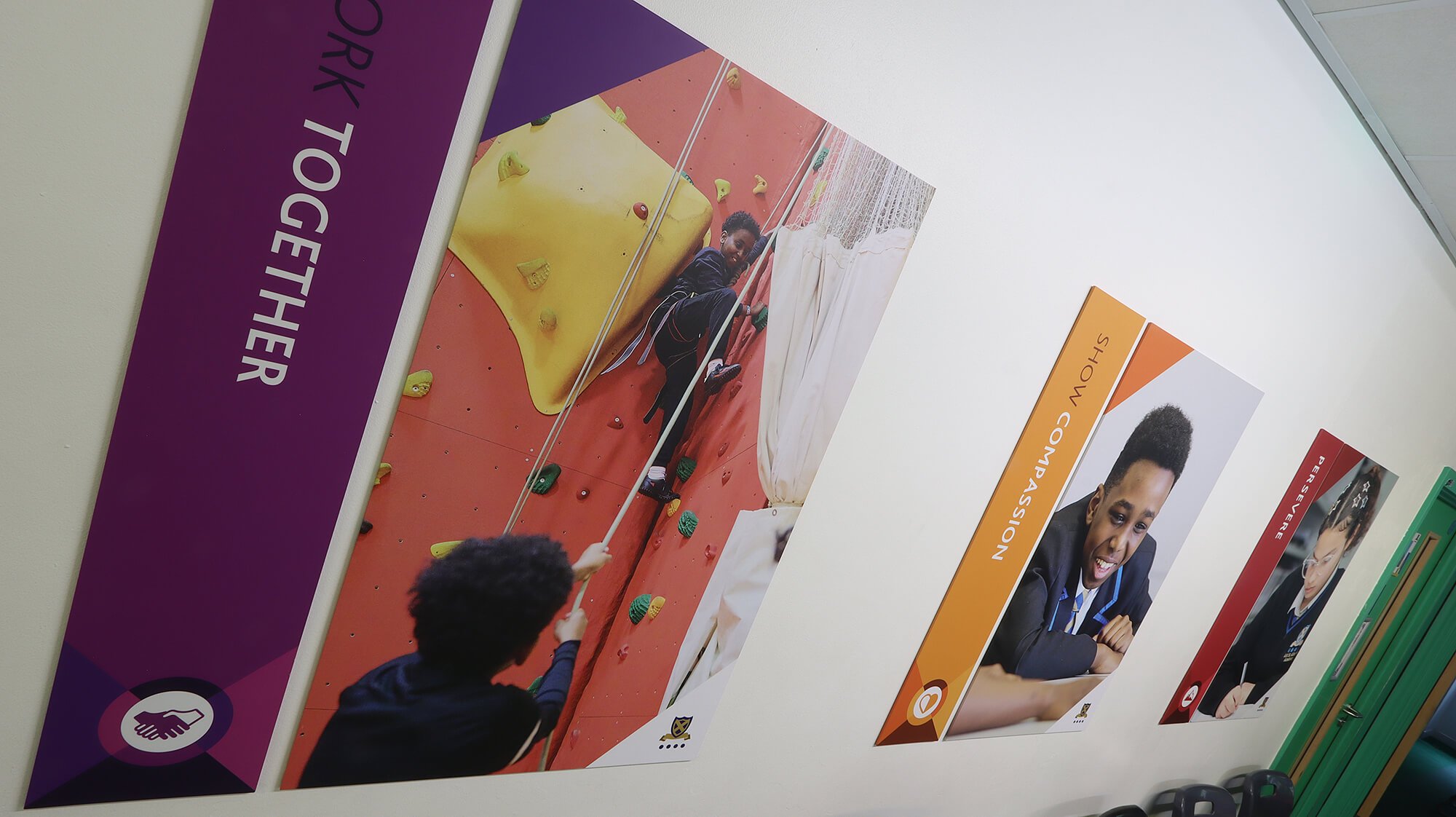
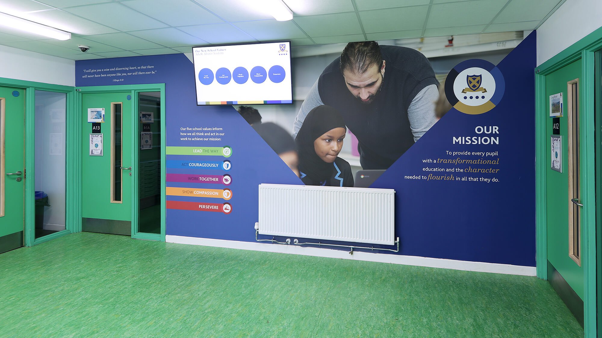
We treated the shared spaces in a few different ways using a mix of shape-cut graphics (values icons), wallpaper graphics and wallboards to create an experience that seemed different around every corner, but was still presenting the message in a consistent way.


A couple of spaces got a more custom approach. The bi-fold doors in the main hall was an example of such a treatment. We’re super-happy with how we worked the design across this jumbo set of doors and the impact it makes in the space is tremendous.
“With schemes like this, it’s important to get the right balance of content, scale and materials. ”
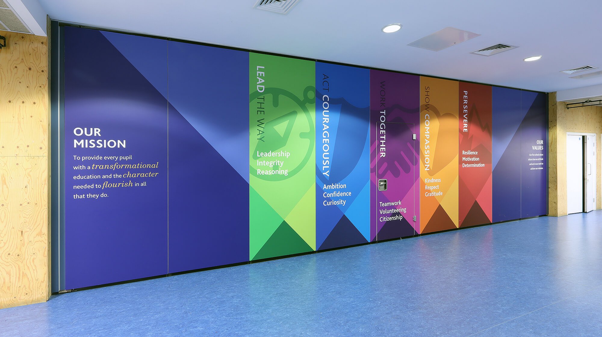
The high-level placement of key scriptures and the mission statement was a challenge but it really helps to make the graphics bed into its surroundings as they become part of the fabric of the building.
