New school branding excites and unites.
We were commissioned by the CEO of a brand new Multi Academy Trust to create a bold new identity that captured the personality and essence of the organisation as well as solve the problem of how to incorporate it into the ten existing school brands.
From the beginning this brief was going to be a challenge as the new branding had to do many different jobs; bring two existing groups of schools together into a new company, be catholic in its tone but corporate in its execution, represent the theme ‘light from the darkness’ and encapsulate the attributes of the saints that the name is based on. Phew!
We explored many possible routes before the final design was agreed but the journey was all part of the process as it always is. The fresh, vibrant colour palette, clean lines and simple iconography capture the vision of the new company perfectly and the CEO was delighted with the final result.

New brand guidelines help to show how to use the new identity.
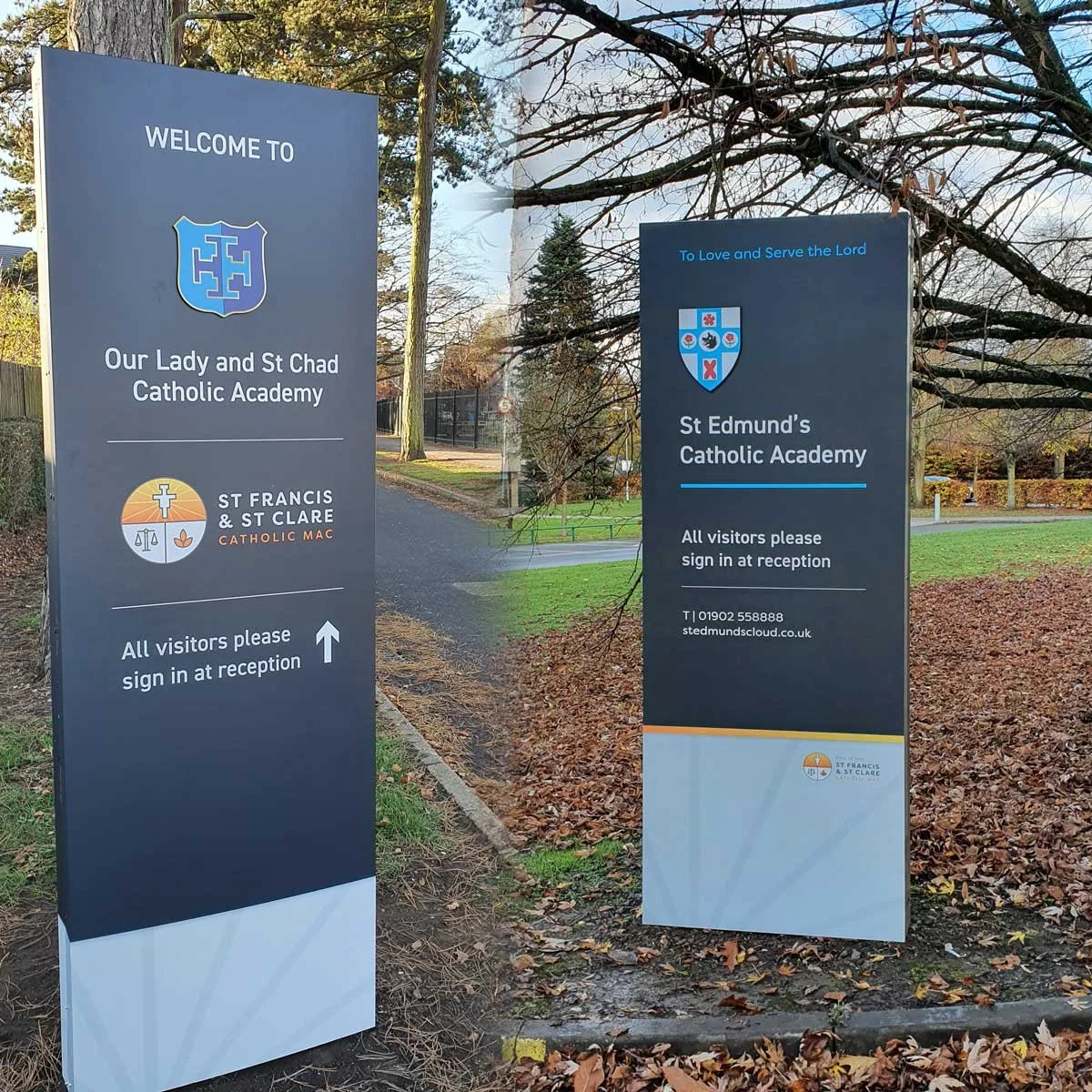
The project also involved designing a new unified signage scheme for the trust that provides better visibility and a consistent profile at every location.
Perhaps the best evidence that we got it right was that the heads of the ten schools almost unanimously opted for the bolder use of the trust branding on their own individual school signs. It can sometimes take a while for people to accept a new brand so it’s amazing that they have adopted it so quickly and so warmly.