
A magnificent result for a new trust.
When two existing groups of schools are merging it’s more important than ever to create a brand that can gain strong and widespread approval from stakeholders. That was what was required when the CEO from Our Lady of the Magnificat approached us to help them bring two catholic MACs together under one banner.
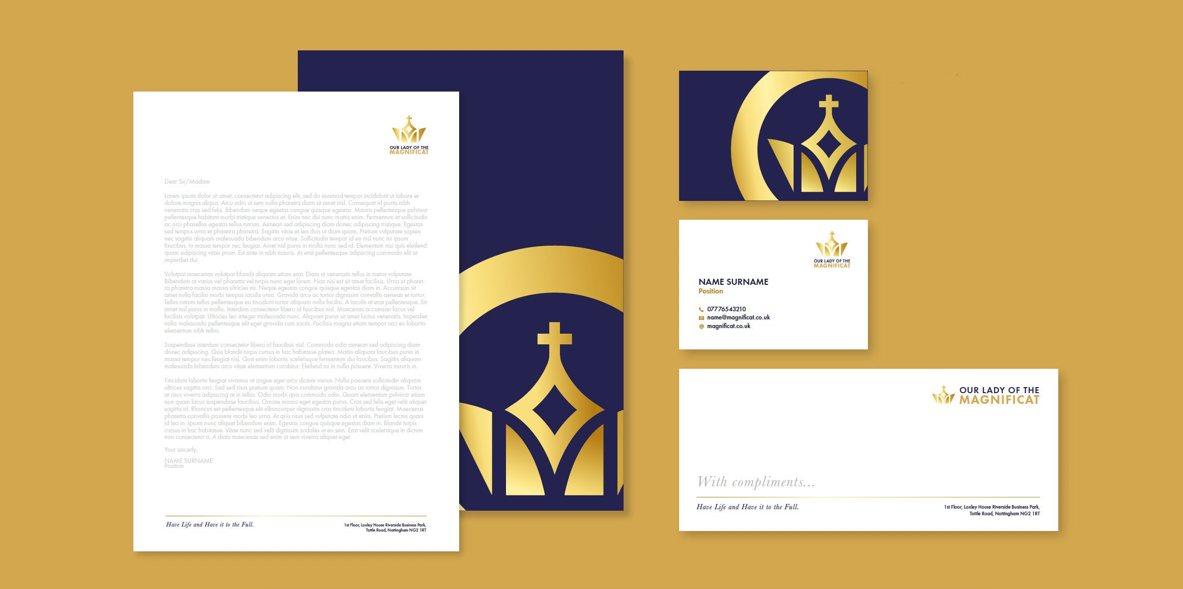
The brief was as clear as it was challenging. The new name was full of significance and meaning, but the final result needed to be clean and simple with a more contemporary style required for the faith-based organisation.
Our process kicked in to start developing ideas based on our early meetings. As is usually the case the early ideas were very helpful at informing the client about what could work and what would not. The feedback was instrumental at steering the design team to develop a final solution that manages to hit all of the boxes required of it with a design based on a stylised crown.

Nested at the heart of the crown is a four-pointed star, combining the symbolism of Mary and a ‘guiding star’. The holy cross sits at the point of the crown. The crown, star and the golden gradient across the logo combine to highlight the excellence, and prominence of the brand. Shades of blue represent Our Lady and golden hues within the mark and text create a feeling of excellence within the brand.